Visual Exploration
The first tidyverse packages we are going to use are the tibble and ggplot2 ones.
tibble - data tables (a reimaging of the classic R
data.frame)ggplot2 - plots (second implementation of Haley’s layered grammar of graphics)
Both of these are automatically loaded when we load the tidyverse library
> library(tidyverse)
In this section we will be focusing on ggplot2. This implements Hadley’s layered grammar of graphics (which builds on Wilkinson’s original grammar of graphics) to allow a very simple and concisely expression of any type of plot.
Creating a Plot
Our data is tibble (tidyverse table/data-frame) containing a subset of the fuel economy data the US Environmental
Protection Agency (EPA) provides on cars from 1999 and 2008 (run ?mpg for more details on the data set).
> mpg
# A tibble: 234 x 11
   manufacturer model      displ  year   cyl trans      drv     cty   hwy fl    class
   <chr>        <chr>      <dbl> <int> <int> <chr>      <chr> <int> <int> <chr> <chr>
 1 audi         a4           1.8  1999     4 auto(l5)   f        18    29 p     compact
 2 audi         a4           1.8  1999     4 manual(m5) f        21    29 p     compact
 3 audi         a4           2    2008     4 manual(m6) f        20    31 p     compact
 4 audi         a4           2    2008     4 auto(av)   f        21    30 p     compact
# … with 230 more rows
You probably already have some assumptions about relationships that may exist in this data, such as, the bigger the
engine displacement (displ) the few miles-per-gallon (mpg) it will get on the highway (hwy). We can quickly
verify this be creating a ggplot.
> ggplot(data=mpg) +
    geom_point(mapping = aes(x=displ, y=hwy))
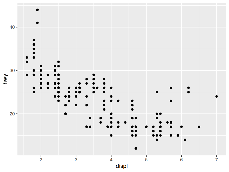
Interestingly, while things look largely like we might expect, there does appear to be some large-engines outliers that still manage to achieve middle-of-the-road fuel economy.
The ggplot() command creates a coordinate system and set defaults. In this case we have specified our default
data source is the mpg tibble. We then add a points geometry layer on top of this. For this layer we specify the
mappings from the information in the data set (defaulted to mpg) we wish to convey to to the visual properties
that of the points that is going to convey that information (their aesthetics)
the
displvalue will be conveyed by the x coordinate of the point andthe
hwyvalue will be conveyed by the y coordinate of the point.
Two other entirely equivalent ways to generate this graph are
> ggplot(data=mpg, mapping = aes(x=displ, y=hwy)) +
    geom_point()
> ggplot() +
    geom_point(data=mpg, mapping = aes(x=displ, y=hwy))
The first one provides all the geom_point specifications as defaults via ggplot and the second provides
none. In generally though you will mostly see the original form as most graphs are generated primarily from
one data set (so it makes sense to make it a default) and aesthetics are generally layer specific.
The complete plot specification we will be covering in the next subsections are
> ggplot(data = <DATA>) +
    <GEOM_FUNCTION>(
      mapping = aes(<MAPPINGS>),
      stat = <STAT>,
      position = <POSITION>
    ) + ... +
    <COORDINATE_FUNCTION> +
    <FACET_FUNCTION> +
    <SCALE_FUNCTION> + ... +
    <GUIDE_FUNCTION> + ... +
    <THEME_FUNCTION> + ...
DATAunderlying data set providing the observationsSTATstatistical transformation (stat) of the information to be displayedGEOM_FUNCTIONgeometric object (geom) to represent informationMAPPINGShow values to be display map to the levels of an aestheticCOORDINATE_FUNCTIONcoordinate system to place the geom intoPOSITIONposition adjustments in the coordinate systemFACET_FUNCTIONsplit the plot into subplotsSCALE_FUNCTIONhow data values are translated to visual propertiesGUIDE_FUNCTIONhelp readers interpret the plotTHEME_FUNCTIONcontrols the display of non-date items
Aesthetic Mappings
We have already been introduced to the (mandatory) x and y aesthetics of the point geom. If we run
?geom_point to check the documentation, we will find that points actually have an five more independent
aesthetics we can use to encode our data. One of these is colour (or color if you prefer the US
spelling). Let’s use this to encode the class of the cars in our data set to see what that may reveal.
> ggplot(data=mpg) +
    geom_point(mapping = aes(x=displ, y=hwy, colour=class))
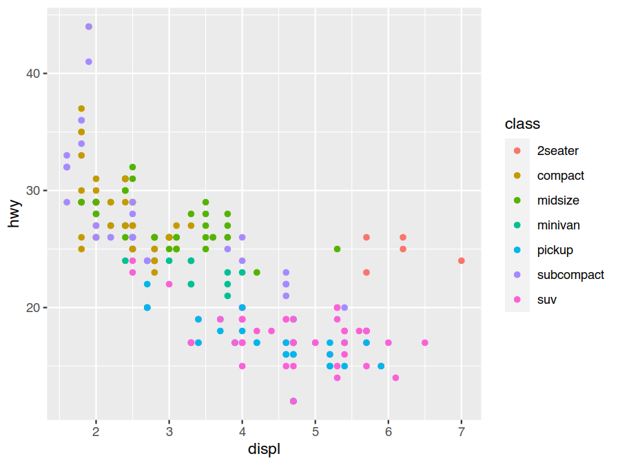
It seems our large-engine outliers are actually sports cars, which makes sense. We certainly would expect them to have much better fuel economy than the SUVs and pickup trucks with similar sized engines below them.
Our aesthetic mapping is not limited to just aesthetic equals variable, but rather it can be any R expression
involving the variables. We can also set the default values used for non-mapped aesthetics by assigning them values
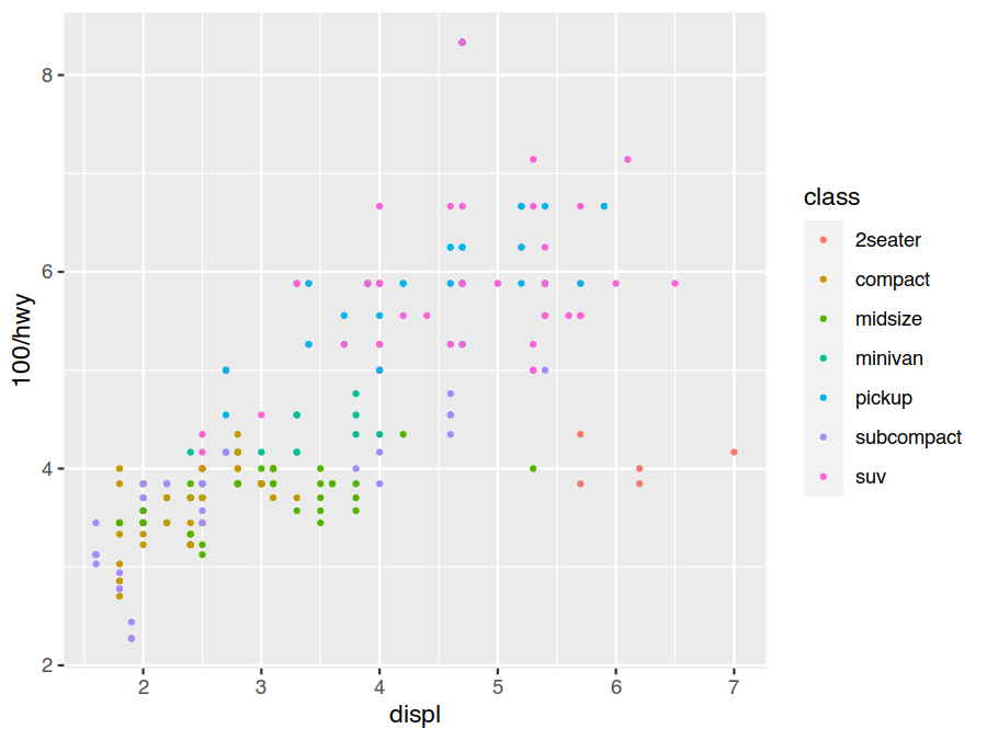
outside of aes. For example, let us decrease the point size for fun, and plot gallons-per-100-miles instead of
miles-per-gallon as miles-per-gallon makes bad fuel economy less evident (e.g., going from 10 to 15 mpg looks to be
the same as going from 25 to 30 mpg, even though the former is a fuel savings of 33% while the later is only 17%).
> ggplot(data=mpg) +
    geom_point(mapping = aes(x=displ, y=100/hwy, colour=class), size=0.75)
Exercises
From the mpg data set help page (?mpg), there are several other variables that we might expect to be related to
fuel consumption. This includes the transmission (number of gears and automatic/standard), the drivetrain
(front-wheel/rear-wheel/four-wheel), the number of cylinders, and the fuel type.
Choose additional
geom_pointaesthetics (?geom_point) to map these variables too as well and see if there are any obvious patterns.Some aesthetics, like position or size, are continuous, while others, like shape, are discrete. What makes an
mpgvariables continuous or discrete. What doesggplothandle discrete/continuous mismatches between aesthetics and variables?
Faceting
While mapping variables to aesthetics is useful for helping understand more about our data, it can become
overwhelming and hard to tell what is going on (is front wheel drive more fuel efficient, or are just most small
cars are front wheel drive?). It is often helpful to compare a common graph (on a common scale) plotted across
different subsets of our data in order to reveal patterns. This is called faceting. It is done by adding a
facet_wrap (1D) or facet_grid (2D) to our plot.
For example, we can compare our standard fuel economy plot across the different manufactures to get an idea if American manufactures deserve their large gas guzzlers reputation.
> ggplot(data=mpg) +
    geom_point(mapping = aes(x=displ, y=100/hwy, colour=class), size=0.5) +
    facet_wrap(facets = vars(manufacturer))
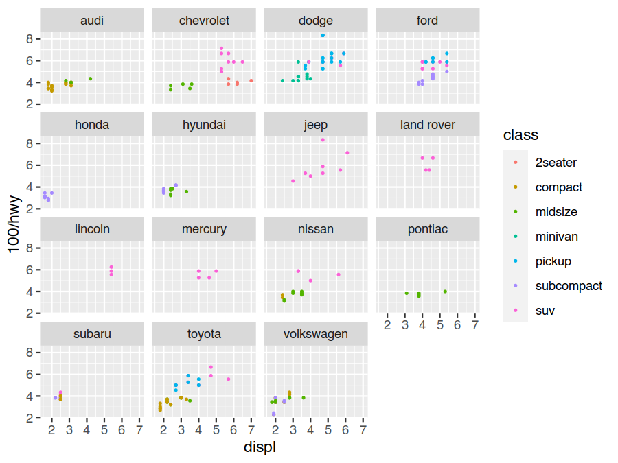
Here we have used the newer vars syntax to specify what variables to facet on. You will also frequently see the
older formula syntax that would look like facets = . ~ manufacture (this is a one-sided formula because
facet_wrap is 1D). For the grid variant, you pass both a rows = vars(...) and cols = vars(...) specification
or a single rows = ... ~ ... using the older formula syntax (a two sided formula because facet_grid is 2D).
Exercises
What happens if you specify multiple variables inside of
vars(sayclassanddrv)? How is this expressed using the formula syntax?Use
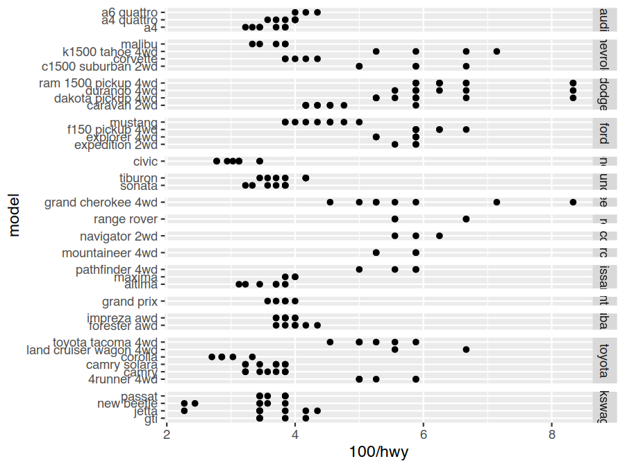
facet_gridto facet on bothdrvandclass. What does this tell us about fuel consumption for the different classes? What happens ifclassis also used for acolouraesthetic at the same time?Fill in the following template to create the following faceted plot. What do the
"free"parameters do (try removing them and see what happens to the plot).> ggplot(data=mpg) + geom_point(mapping = aes(x=..., y=...)) + facet_grid(rows = vars(...), scales="free", space="free")
Geometric Objects
So far we have been representing our data with a point geom. This is just one of the many geoms (there are over 40
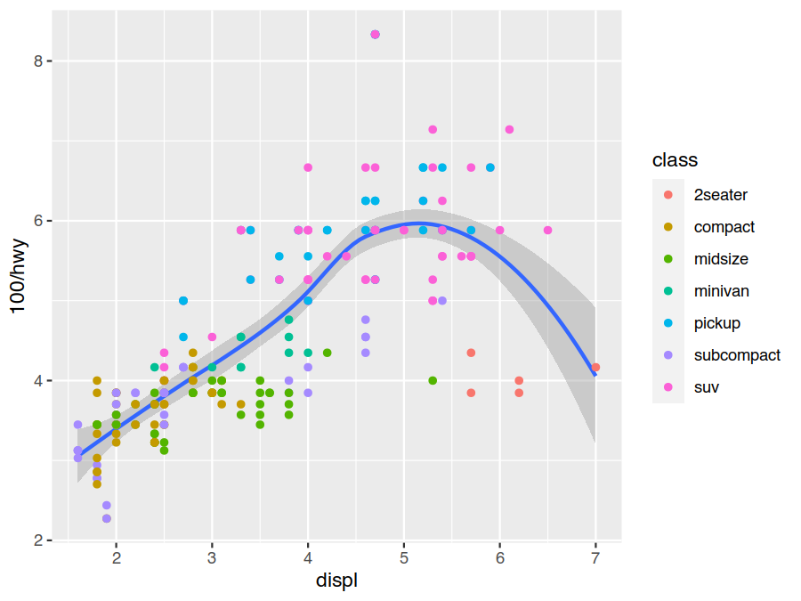
of them!) we can choose from when creating plots, and we can add as many as we want in each plot. For example, we
can add a geom_smooth to show the smoothed conditional in our relations along with its 95% confidence interval
(the more points there are, and the closer they are together, the more confident we are in our means calculation).
> ggplot(data=mpg) +
    geom_smooth(mapping = aes(x=displ, y=100/hwy)) +
    geom_point(mapping = aes(x=displ, y=100/hwy, colour=class))
In this case we can also avoid some duplicate aes definitions by putting the common ones in the initial ggplot
call to make them the defaults.
> ggplot(data=mpg, mapping = aes(x=displ, y=100/hwy)) +
    geom_smooth() +
    geom_point(mapping = aes(colour=class))
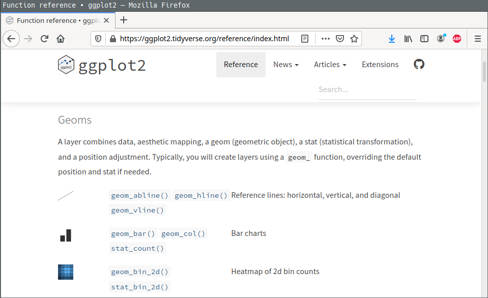
Generally, when creating a plot, it is easiest to go to the ggplot2 reference
page on the tidyverse website and scroll down through the 40+
geometric objects (geoms) available until we find what we are looking for. Clicking on it brings up a detailed page
including many example ggplot calls and their output.
Exercises
What geom would you use to draw a line chart? A histogram? To put arbirary text labels on your plot?
What happens when we add the
group=classmapping togeom_smooth? How does this compare to adding thecolour=classmapping?
Statistical Transformations
Data in ggplot actually goes through a series of transformations on its way to be plotted. This includes a
specified statistical transformation and a final scale transformation. Values can be pulled from either of these
stages in our aesthetics mapping by using the after_stat and after_scale wrappers. The default stat for
geom_point is identity (do nothing) because it is used to plot raw values. The default stat for geom_smooth
is smooth because it plots the smoothed average and its estimated standard error.
Another example of a geom that has a non-identity default stat is geom_bar. It is stat=count, and it counts
the number of observations for each unique group (which is, by default, the interaction of all discrete variables
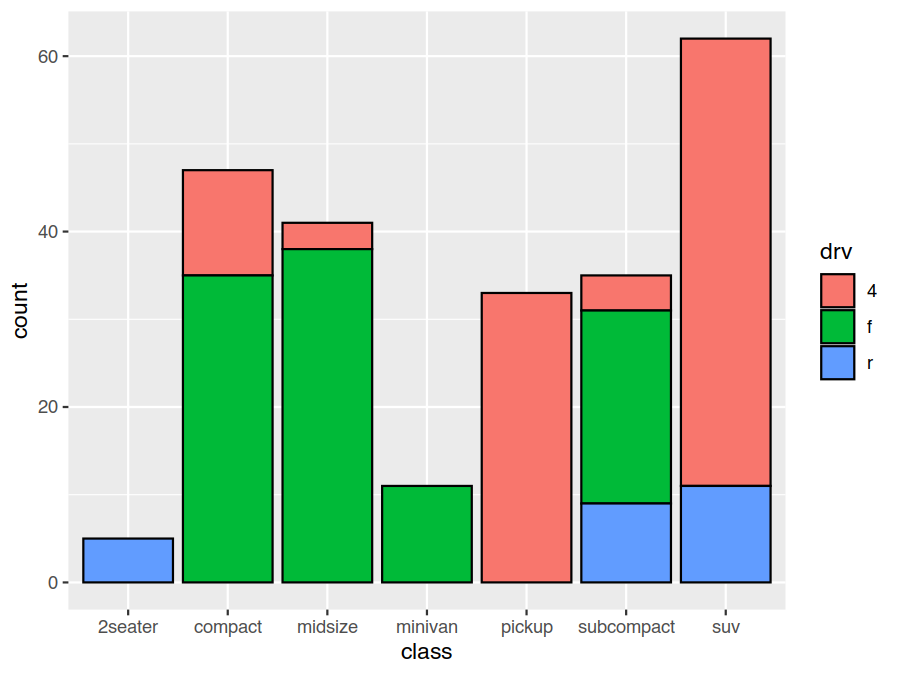
as implied by the aesthetics mapping). This lets us easily do things like generate stacked bar charts giving the
number of vehicles for each class and drivetrain type
> ggplot(data=mpg) +
    geom_bar(mapping = aes(x=class, fill=drv), colour="black")
When we add a geom layer, we are being explicitly stating our geom and implicitly about our stat. An alternative is
to add a stat layer, which is explicit about our stat and implicit about our geom. The equivalent stat layer to
geom_bar is stat_count. Its default geom is bar. This means either of these give us a bar geom with a
count stat. The above plot is equally well specified as
> ggplot(data=mpg) +
    stat_count(mapping = aes(x=class, fill=drv), colour="black")
As mentioned earlier, the height of the bar (its y aesthetic) is implicitly coming from the count stat
transform, and we can also be explicitly about this mapping by using the after_stat wrapper in our aes. An
example of where we might want to do this is to normalize the counts to the unit interval.
> ggplot(data=mpg) +
    geom_bar(mapping = aes(x=class, y=after_stat(count/sum(count)), fill=drv), colour="black")
Exercises
Adding
stat_summarygives the a summary value along with a min and max bound (defaulting to the mean and its standard error). What would the equivalentgeom_*layer be (start with the help page forstat_summary)?> ggplot(data=mpg, mapping = aes(x=class, y=100/hwy)) + geom_point() + stat_summary(colour="red")
Provide appropriate
fun,fun.min, andfun.maxparameters to change the above to showing the median and 25% and 75% quantiles?
Position Adjustments
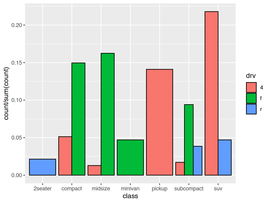
An interesting thing revealed in explicitly specifying the y aesthetic is that geom_bar (or stat_count)
doesn’t actually put the individual bars at the specified position. Rather, it offsets the individual bars for each
driveline type upwards so they stack on top of each other to give a stacked bar chart.
This is due to a position adjustment specification which tweaks the layout to achieve various desired effects. As
with stats, the various geoms have different default position adjustments. For geom_bar it is position="stack"
(equivalently position=position_stack()). We can override this though with a variety of specifications (see
?geom_bar) include dodge, which places the bars side-by-side.
> ggplot(data=mpg) +
    geom_bar(mapping = aes(x=class, y=after_stat(count/sum(count)), fill=drv), position="dodge", colour="black")
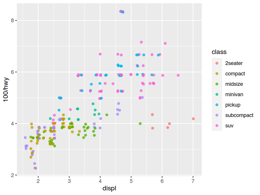
As with the stat, the geom_point default is position="identity" (do nothing). A useful override for scatter
plots is position="jitter". This perturbs the final positions by a small random amount which, while making the
final plot slightly less accurate on a local scale, reveals more large scale detail by avoiding overlapping points.
Here we plot this over top of the original scatter plot for reference
> ggplot(data=mpg) +
    geom_point(mapping = aes(x=displ, y=100/hwy, colour=class), position="jitter", alpha=0.75)
Exercises
How does
geom_jitterandgeom_countcompare to usingposition="jitter"withgeom_pointas above?How would you control the amount of jitter added to the positions?
Coordinate Systems
While one of the most complex part of ggplot2 is the coordinate system, the layered grammar of graphics makes it very easy to use. If we want to override the default Cartesian coordinate system, we just add in a coordinate system layer. There are a number commonly used ones, including
coord_fixed- Cartesian coordinates with a fixed aspect ratiocoord_flip- Cartesian coordinates with axandyflippedcoord_map- map projectionscoord_polar- polar coordinates
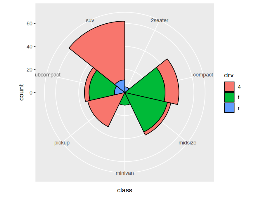
Bar charts in polar coordinates make a variety of interesting looking pie-style charts (these should be avoided due to the numerous interpretation issues inherent in pie-style charts as an internet search will reveal).
> ggplot(data=mpg) +
    geom_bar(mapping = aes(x=class, fill=drv), width=1, colour="black") +
    coord_polar()
Exercises
Compare using
coord_flipto specifying ayaesthetic mapping instead of anxone for the bar chart.Create a pie chart of the number of vehicles of each class. You will need a mapping that gives a constant radius and incrementing (stacked) angles to your polar coordinates.
Scales and Labels
Each aesthetic is associated with a single shared scale that maps the input range to the output range. Examples we
have already seen of this include the coordinate mapping for the x and y aesthetics and the colour mapping for
the colour and fill aesthetics. A default is chosen for each aesthetic based on the aesthetics mappings we
provide. Adding a scale function allows us to take custom control of this.
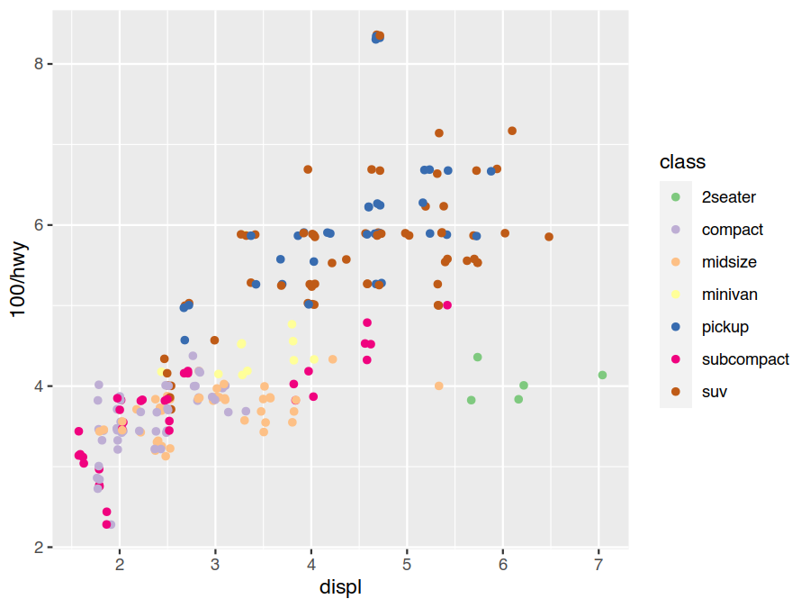
The default discrete colour and fill scales use equally spaced hue values. This isn’t ideal as hue isn’t colour
blind friendly (1 in every 12 people have some form of colour blindness), nor does it photocopy well. A better
choice, for a discrete data set, would be to use the qualitative scheme from
ColorBrewer.
> ggplot(data=mpg) +
    geom_point(mapping = aes(x=displ, y=100/hwy, colour=class), position="jitter") +
    scale_colour_brewer(type="qual")
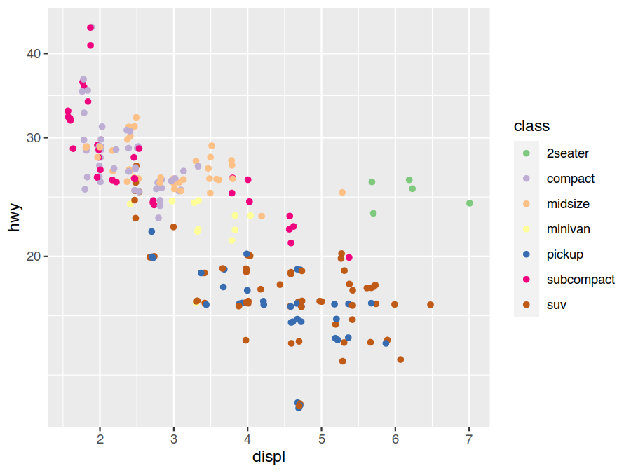
Another common coordinate scale change to make is linear to logarithmic. This converts constant multiples to constant increments, making relative comparisons natural, and is a good choice to expand out small values and compress large ones. Earlier we switched from miles-per-gallon to gallons-per-mile as the former was visually compressing the bad-fuel-economy range. Another option would have been to use a log scale.
> ggplot(data=mpg) +
    geom_point(mapping = aes(x=displ, y=hwy, colour=class), position="jitter") +
    scale_colour_brewer(type="qual") +
    scale_y_log10()
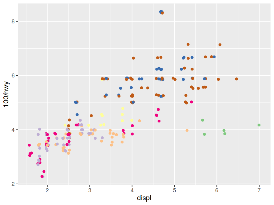
The scale legends are provided by guides. These inherit a lot of their details from the scale specifications, but
it is also possible to explicitly configure them on either a global of per-scale/aesthetic level. The former is
done by adding a guide_* to the plot with the desired parameters. The later is done by specifying a guide=...
argument in a scale_* call or a guide aesthetic map to our plot. As an example of the last of these, the class
colour legend is trivially hid by specifying the guide mapping colour="none" (equivalently colour=guide_none()).
ggplot(data=mpg) +
    geom_point(mapping = aes(x=displ, y=100/hwy, colour=class), position="jitter") +
    scale_colour_brewer(type="qual") +
    guides(colour="none")
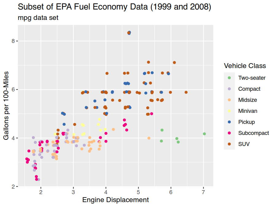
Details of labels and limits of scales can also be adjusted by providing appropriate options to scale_* and
guide_*. These operations are so common though that the convenience functions labs (further ggtitle, xlab,
and ylab) and lims (further xlim, ylim, and various expansion routines) have been provided.
> ggplot(data=mpg) +
    geom_point(mapping = aes(x=displ, y=100/hwy, colour=class), position="jitter") +
    scale_colour_brewer(type="qual", labels=c("Two-seater","Compact","Midsize",
                                              "Minivan","Pickup","Subcompact","SUV")) +
    labs(title="Subset of EPA Fuel Economy Data (1999 and 2008)", subtitle="mpg data set",
         x="Engine Displacement", y="Gallons per 100-Miles", colour="Vehicle Class")
The above specification of the legends labels is fragile as changing the data can result in the plot labels
becoming mismatched. A minimum solution is to also specify limits=("2seater","compact",...) (this is defaulting
to all values in alphabetical order) so both parts are explicit and together. A better solution would be to use the
tidyverse forcats package to correct and order the data labels in the data itself.
Exercises
Use
ggtitle,xlab, andylabto specify the title and axis labels instead oflabs.Use the limit functions to ensure
0is included in the gallons-per-100-miles axis. Would it be best to do this withlims,ylim, orexpand_limits?Override the guide in the following plot so cylinder numbers are shown discretely instead of continuously.
> ggplot(data=mpg) +
    geom_point(mapping = aes(x=displ, y=100/hwy, colour=cyl), position="jitter")
Themes
Themes control the display of all non-data elements of plots. There are several complete themes to choose from, as
well as a system of inheritance that makes it possible to specify styling at many levels. For example,
axis.title.x.top inherits from axis.title.x, which inherits from axis.title, which inherits from title
making it possible to easily specify very general or specific tweaks.
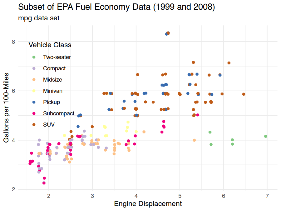
As an example, we can use the minimal theme to entirely change the look of our plot while also moving the legend into the open space in the upper-right corner to recover the area on the far right for plotting.
> ggplot(data=mpg) +
    geom_point(mapping = aes(x=displ, y=100/hwy, colour=class), position="jitter") +
    scale_colour_brewer(type="qual", labels=c("Two-seater","Compact","Midsize",
                                              "Minivan","Pickup","Subcompact","SUV")) +
    labs(title="Subset of EPA Fuel Economy Data (1999 and 2008)", subtitle="mpg data set",
         x="Engine Displacement", y="Gallons per 100-Miles", colour="Vehicle Class") +
    theme_minimal() +
    theme(legend.justification=c("left","top"), legend.position=c(0.025,0.925))
Exercises
Make all text in the above plot approximately 25% as smaller. Decrease only the legend text by approximately 25%. Why is it a good idea to use
relwhen specifying text sizes?In an earlier exercise we created the following plot. Change the orientation of the manufacteur facets on the far right to horizontal from vertical so they are not cut off.
> ggplot(data=mpg) +
    geom_point(mapping = aes(x=100/hwy, y=model)) +
    facet_grid(rows = vars(manufacturer), scales="free", space="free")